How to Prevent Layout Shift (CLS) with CSS Aspect Ratios
How to Prevent Layout Shift (CLS) with CSS Aspect Ratios
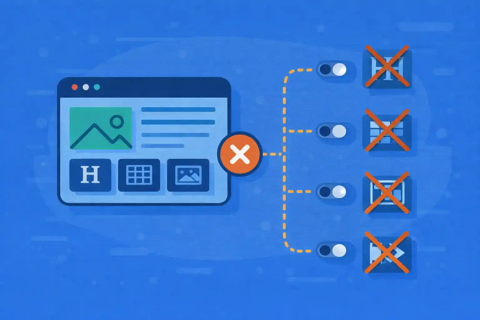
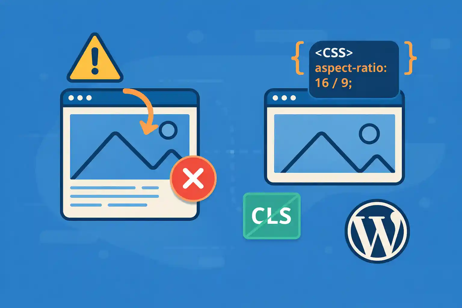
CLS (Cumulative Layout Shift) is a Core Web Vitals metric that measures how much the page layout “jumps” while loading. One of the biggest causes is images, embeds, and ads loading without reserved space.
The simplest modern fix is the CSS aspect-ratio property. It lets you reserve the correct space before media loads—so the layout stays stable.
What Causes CLS (In Plain English)
- Images without fixed dimensions (width/height) or reserved space
- Responsive embeds (YouTube, iframes) loading late
- Lazy-loaded images that don’t reserve height
- Web fonts swapping after render (FOIT/FOUT)
- Ads and widgets inserted after initial paint
In this article, we focus on the most common CLS win: media with missing height.
The Modern Solution: CSS aspect-ratio
aspect-ratio tells the browser how tall an element should be relative to its width. This allows the browser to allocate space immediately, even before the image loads.
.media {
  aspect-ratio: 16 / 9;
}
If the container is responsive, the height adjusts automatically while keeping the ratio.
1) Prevent CLS for Responsive Images
Recommended pattern: fixed ratio container + object-fit
This is the best approach for card thumbnails, featured images, and grids.
<figure class="thumb">
  <img src="image.jpg" alt="..." loading="lazy">
</figure>
.thumb {
aspect-ratio: 16 / 9;
overflow: hidden;
}
.thumb img {
width: 100%;
height: 100%;
object-fit: cover;
display: block;
}- The
figurereserves space immediately object-fit: coverprevents distortiondisplay: blockavoids inline-image baseline gaps
2) Use aspect-ratio for Hero Images
Hero images are often the biggest CLS offenders because they appear above the fold.
<div class="hero">
  <img src="hero.jpg" alt="..." fetchpriority="high">
</div>
.hero {
aspect-ratio: 21 / 9;
overflow: hidden;
}
.hero img {
width: 100%;
height: 100%;
object-fit: cover;
display: block;
}Tip: For LCP improvements, don’t lazy-load your primary hero image.
3) Prevent CLS for YouTube / iframe Embeds
Embeds often load late and push content down unless you reserve space.
<div class="embed">
  <iframe
    src="https://www.youtube.com/embed/VIDEO_ID"
    title="YouTube video"
    loading="lazy"
    allowfullscreen></iframe>
</div>
.embed {
aspect-ratio: 16 / 9;
}
.embed iframe {
width: 100%;
height: 100%;
border: 0;
display: block;
}This keeps the page stable while the iframe loads.
4) Aspect Ratio + WordPress Featured Images
If you output featured images in archive cards, reserve the space at the wrapper level.
<a class="card" href="<?php the_permalink(); ?>">
  <span class="card-thumb">
    <?php the_post_thumbnail( 'medium_large', array( 'loading' => 'lazy' ) ); ?>
  </span>
  <span class="card-title"><?php the_title(); ?></span>
</a>
.card-thumb {
aspect-ratio: 16 / 9;
overflow: hidden;
display: block;
}
.card-thumb img {
width: 100%;
height: 100%;
object-fit: cover;
display: block;
}Even if the image is lazy-loaded, the card won’t jump because the space is reserved.
5) What About width/height Attributes?
Good news: modern WordPress typically outputs width and height attributes automatically for images, which already helps prevent CLS.
However, aspect-ratio is still valuable when:
- You’re using background images
- You need consistent cropping (cards/grids)
- CSS changes the rendered size significantly
- Embeds/iframes don’t have stable sizing
Best practice: Use both — let WordPress output dimensions, and use aspect-ratio on containers for consistent layout stability.
6) Fallback for Older Browsers (Optional)
Most modern browsers support aspect-ratio. If you still need a fallback, use the classic padding technique.
.thumb {
  position: relative;
}

.thumb::before {
  content: "";
  display: block;
  padding-top: 56.25%; /* 16:9 */
}

.thumb img {
  position: absolute;
  inset: 0;
  width: 100%;
  height: 100%;
  object-fit: cover;
}
Use this only if you must support older environments.
Common CLS Mistakes to Avoid
- Using
height: autoon media containers without reserving space - Lazy-loading above-the-fold hero images
- Injecting banners/announcements after page load without a placeholder
- Loading ads without fixed-size slots
- Different image ratios in the same grid (causes uneven card heights)
Quick Checklist
- Reserve space for media using
aspect-ratio - Use
object-fit: coverfor consistent thumbnails - Wrap embeds/iframes in a ratio container
- Don’t lazy-load your main LCP image
- Keep ratios consistent in grids and archives
Conclusion
Preventing layout shift is mostly about one thing: reserve space before content loads. CSS aspect-ratio makes this easy for images, featured thumbnails, iframes, and responsive media — and it’s one of the quickest wins for improving CLS in WordPress.
Key takeaway:
Use an aspect-ratio container + object-fit for stable, responsive layouts that don’t jump.
🎨 Want to learn more? Visit our WordPress Customization Hub for tips and advanced techniques.