How to Create a Sticky Sidebar Without JavaScript
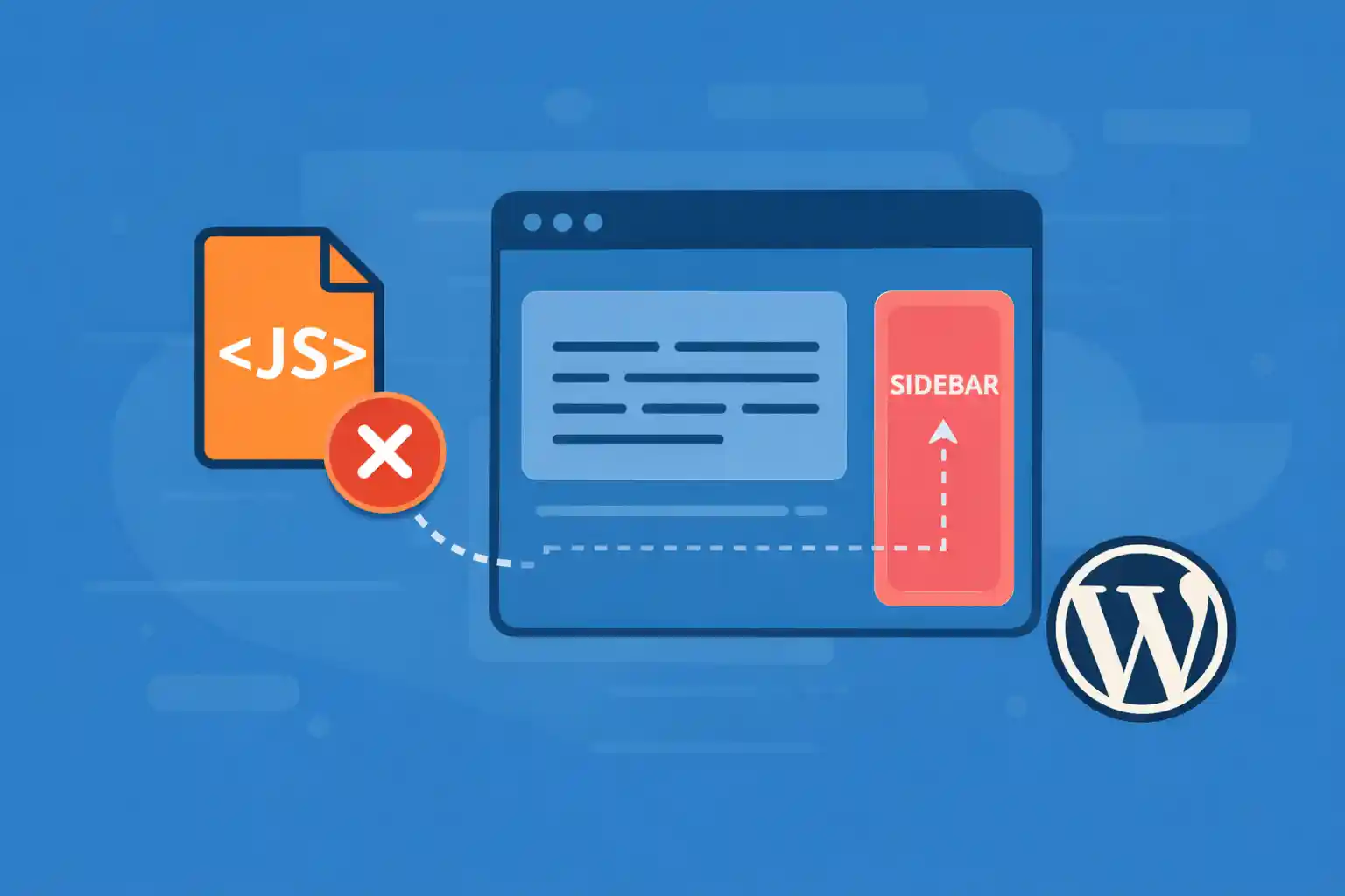
How to Create a Sticky Sidebar Without JavaScript
A sticky sidebar keeps important content visible while the user scrolls — such as a Table of Contents, newsletter signup, ads, or related links. The best part: you can build a sticky sidebar using pure CSS with position: sticky, without any JavaScript.
This guide shows the clean, reliable way to implement a sticky sidebar in WordPress (or any site), including common pitfalls and fixes.
When a Sticky Sidebar Makes Sense
- Table of contents (TOC)
- CTA box (download, newsletter, lead magnet)
- Related posts / popular posts
- Affiliate disclosure or pricing box
- Ad slots (with proper reserved space)
Tip: Don’t make everything sticky. Choose one key element per layout.
Core Concept: position: sticky
position: sticky behaves like relative until the element reaches a defined offset (like top: 24px), then it “sticks” within its scroll container.
.sidebar-inner {
  position: sticky;
  top: 24px;
}
No scripts. No scroll events. Just CSS.
Minimal HTML Structure
You need a layout with a main content area and a sidebar. Here’s a simple pattern:
<div class="layout">
  <main class="content">
    <!-- main content -->
  </main>

  <aside class="sidebar">
    <div class="sidebar-inner">
      <!-- sticky widget content -->
    </div>
  </aside>
</div>
Only the inner sidebar content needs to be sticky.
CSS for a Sticky Sidebar (Works in Most Themes)
.layout {
  display: grid;
  grid-template-columns: minmax(0, 1fr) 320px;
  gap: 32px;
  align-items: start;
}

.sidebar-inner {
  position: sticky;
  top: 24px;
}
Why align-items: start matters: It prevents grid stretching behavior that can break sticky positioning.
Make It Responsive (Disable Sticky on Mobile)
Sticky sidebars often feel cramped on small screens. A common solution is to disable sticky on mobile.
@media (max-width: 960px) {
  .layout {
    grid-template-columns: 1fr;
  }

  .sidebar-inner {
    position: static;
    top: auto;
  }
}
Prevent Overlapping a Sticky Header
If your site has a fixed header, your sidebar may stick underneath it. Increase the top offset.
.sidebar-inner {
  position: sticky;
  top: 88px; /* header height + spacing */
}
If your header height changes across breakpoints, update this in media queries.
Common Reasons Sticky Sidebar “Doesn’t Work”
If your sticky sidebar isn’t sticking, it’s almost always one of these:
1) A parent element has overflow set
position: sticky won’t work if any ancestor has:
overflow: hiddenoverflow: autooverflow: scroll
Fix by removing or adjusting overflow:
.layout,
.sidebar,
.content {
  overflow: visible;
}
2) The parent container doesn’t have enough height
Sticky works only within the height of its scroll container. If your sidebar’s parent is shorter than the sticky element, it can’t “stick” properly.
Fix by ensuring the layout container stretches naturally with content (avoid fixed heights).
3) Flexbox stretching issues
If you use Flexbox, sticky can break when items stretch. You can still use Flexbox — just align correctly.
.layout {
  display: flex;
  gap: 32px;
  align-items: flex-start;
}

.content {
  flex: 1 1 auto;
  min-width: 0;
}

.sidebar {
  width: 320px;
}
.sidebar-inner {
position: sticky;
top: 24px;
}Grid is often simpler, but Flexbox can work too.
Sticky Sidebar Inside WordPress (Practical Use)
Most WordPress themes output a sidebar area already (like <aside id="secondary">). You can usually target the widget wrapper or add an inner wrapper.
Example selector pattern:
#secondary .widget-area {
  position: sticky;
  top: 24px;
}
If your theme doesn’t have a clean wrapper, add one in the sidebar template and apply sticky to that wrapper.
Add a Max Height (Optional)
If your sticky sidebar content is long, it may exceed the viewport height. You can limit it and enable scrolling inside the sidebar.
.sidebar-inner {
  position: sticky;
  top: 24px;
  max-height: calc(100vh - 48px);
  overflow: auto;
}
Note: This adds internal scrolling, which isn’t always ideal UX. Use only when necessary.
Conclusion
A sticky sidebar is one of the easiest high-impact UX upgrades you can add to a WordPress site — and you don’t need JavaScript. With position: sticky, a proper layout container, and a careful eye on overflow and alignment, you can create a reliable sticky sidebar that works across modern browsers.
Key takeaway:
Use a sticky inner wrapper, set a sensible top offset, and avoid overflow on parent containers.
🎨 Want to learn more? Visit our WordPress Customization Hub for tips and advanced techniques.