Create a Mobile-Only Menu Without a Plugin (WordPress)
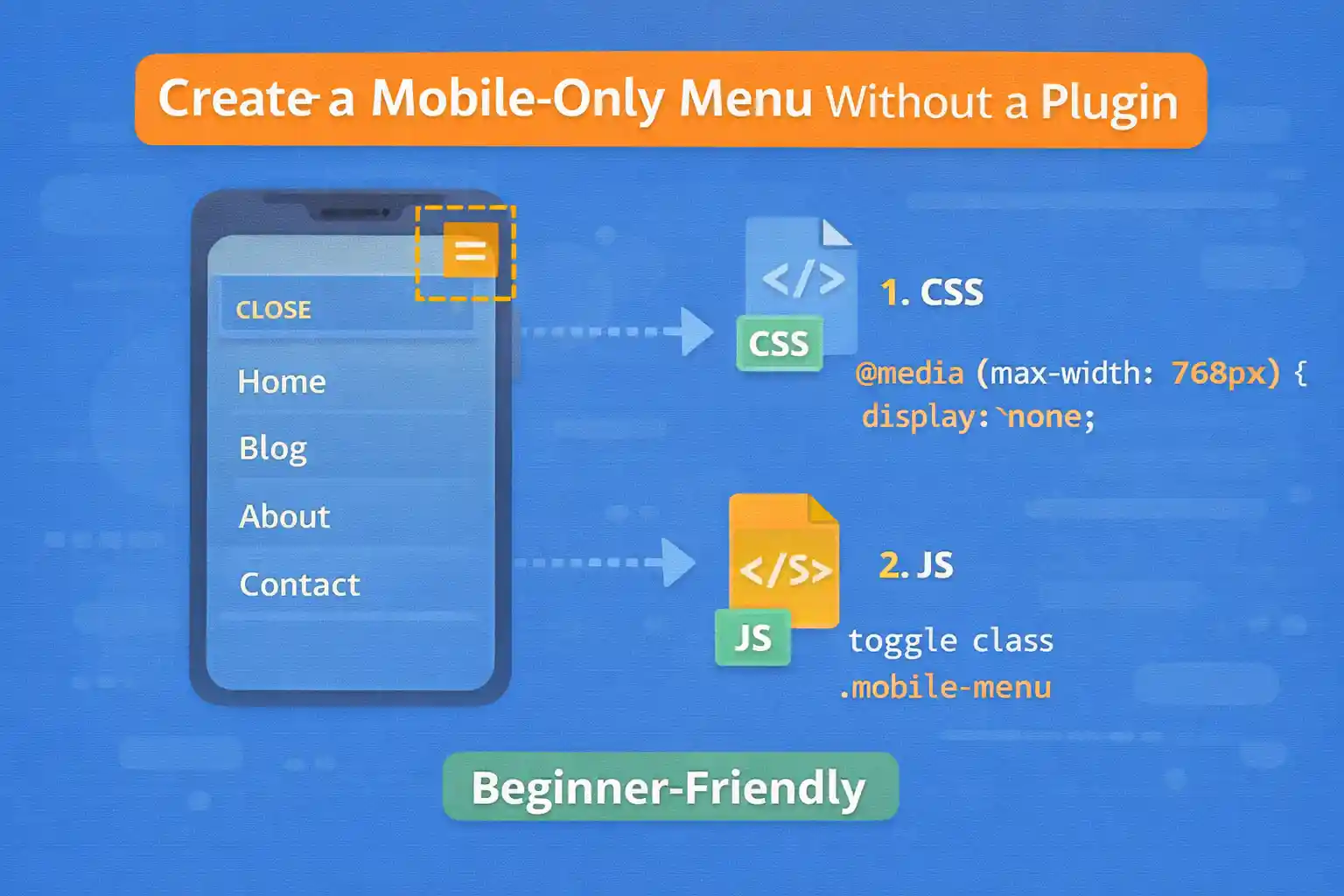
Many WordPress themes use one navigation menu for all devices. But sometimes you want a separate mobile-only menu — for example, a simplified structure, fewer items, or a bottom navigation bar.
This guide shows how to build a mobile-only menu without any plugin, using a clean theme setup:
- Register a separate menu location
- Output it in your theme
- Show/hide it with CSS (mobile-only)
- Add optional JavaScript for a toggle (hamburger drawer)
1) Register a Mobile Menu Location
Add this to your theme’s functions.php (or your menu registration file).
add_action( 'after_setup_theme', function() {

  register_nav_menus( array(
    'primary' => 'Primary Menu',
    'mobile'  => 'Mobile Menu',
  ) );

} );
Now you’ll see a new location in Appearance → Menus (or Appearance → Editor for block themes).
2) Assign a Menu to the Mobile Location
Create a new menu like “Mobile Menu” and assign it to the Mobile Menu location.
Keep it simple:
- Home
- Blog
- Categories
- Contact
3) Output the Mobile Menu in Your Theme
Add this where you want the mobile menu to appear, typically in header.php (or a header template part).
<nav class="mobile-nav" aria-label="Mobile menu">
  <?php
  wp_nav_menu( array(
    'theme_location' => 'mobile',
    'container'      => false,
    'menu_class'     => 'mobile-nav__list',
    'fallback_cb'    => false,
    'depth'          => 2,
  ) );
  ?>
</nav>
Tip: fallback_cb => false prevents WordPress from outputting a random page menu if no menu is assigned.
4) Make It Mobile-Only with CSS
Add CSS to your stylesheet:
.mobile-nav {
  display: none;
}

@media (max-width: 768px) {
  .mobile-nav {
    display: block;
  }

  .site-header .primary-nav {
    display: none;
  }
}
This shows the mobile menu on small screens and hides the desktop nav (adjust selectors to match your theme).
Option A: Simple Mobile Menu (Always Visible)
If you want a basic mobile menu that’s always visible under the header, you’re done.
But many sites prefer a drawer/hamburger menu.
Option B: Mobile Drawer Menu (Hamburger Toggle)
This section adds a toggle button and a sliding panel. It stays lightweight and accessible.
5) Add the Toggle Button
Place this near your mobile nav markup (usually inside the header):
<button class="mobile-nav-toggle"
  type="button"
  aria-controls="mobile-nav-panel"
  aria-expanded="false">
  Menu
</button>
6) Wrap the Menu in a Panel
Update your menu markup to include an ID and panel container:
<div id="mobile-nav-panel" class="mobile-nav-panel" hidden>
  <nav class="mobile-nav" aria-label="Mobile menu">
    <?php
    wp_nav_menu( array(
      'theme_location' => 'mobile',
      'container'      => false,
      'menu_class'     => 'mobile-nav__list',
      'fallback_cb'    => false,
      'depth'          => 2,
    ) );
    ?>
  </nav>
</div>
7) CSS for the Drawer Panel
.mobile-nav-toggle {
  display: none;
}

.mobile-nav-panel {
  position: fixed;
  top: 0;
  right: 0;
  width: min(320px, 85vw);
  height: 100vh;
  padding: 16px;
  background: #fff;
  box-shadow: -8px 0 24px rgba(0,0,0,0.15);
  overflow-y: auto;
  z-index: 9999;
}

@media (max-width: 768px) {
  .mobile-nav-toggle {
    display: inline-flex;
    align-items: center;
    gap: 8px;
  }
}
8) JavaScript to Toggle the Drawer
Add this as a small script file (or inline). It toggles hidden and updates aria-expanded.
document.addEventListener('DOMContentLoaded', () => {
  const btn = document.querySelector('.mobile-nav-toggle');
  const panel = document.querySelector('#mobile-nav-panel');

  if (!btn || !panel) return;

  const open = () => {
    panel.hidden = false;
    btn.setAttribute('aria-expanded', 'true');
  };

  const close = () => {
    panel.hidden = true;
    btn.setAttribute('aria-expanded', 'false');
  };

  btn.addEventListener('click', () => {
    const expanded = btn.getAttribute('aria-expanded') === 'true';
    expanded ? close() : open();
  });

  document.addEventListener('keydown', (e) => {
    if (e.key === 'Escape') close();
  });

  document.addEventListener('click', (e) => {
    if (panel.hidden) return;

    const clickedInside = panel.contains(e.target) || btn.contains(e.target);
    if (!clickedInside) close();
  });
});
9) Enqueue the Mobile Menu Script (Optional)
If you saved the JS to /assets/js/mobile-menu.js:
add_action( 'wp_enqueue_scripts', function() {

  $path = get_stylesheet_directory() . '/assets/js/mobile-menu.js';

  wp_enqueue_script(
    'mobile-menu',
    get_stylesheet_directory_uri() . '/assets/js/mobile-menu.js',
    array(),
    file_exists( $path ) ? filemtime( $path ) : null,
    true
  );

} );
Common Mistakes to Avoid
- Using one menu for everything and hiding items randomly (hard to maintain)
- Forgetting
fallback_cb => false(unexpected menus appear) - Not handling accessibility (
aria-expanded, Escape key) - Hiding menus only with JS (users without JS should still navigate)
Conclusion
A mobile-only menu is easy to build in WordPress without plugins: register a separate menu location, output it in your theme, and control visibility with CSS. If you need a modern drawer menu, add a small toggle script and keep it accessible.
Key takeaway:
Use a dedicated menu location for mobile — it’s cleaner, easier to manage, and scales better than conditional hacks.
🎨 Want to learn more? Visit our WordPress Customization Hub for tips and advanced techniques.