How to Add Custom Image Sizes for Retina Displays
How to Add Custom Image Sizes for Retina Displays
Modern devices often have device pixel ratios of 2x or higher. If your theme serves only standard-resolution images,
they may look blurry on Retina (high-DPI) displays. WordPress already supports responsive images via srcset,
but you must define appropriate image sizes to take advantage of it.
This article explains how to add Retina-ready custom image sizes in WordPress,
how WordPress selects them automatically, and how to use them correctly without bloating storage or harming performance.
How WordPress Handles Retina Images
WordPress does not have a special “Retina mode”.
Instead, it generates multiple image sizes and uses srcset and sizes
to let the browser choose the best file for the device.
Your job is to:
- Define logical base sizes (CSS display size)
- Generate 2x (or higher) image variants
- Let WordPress handle
srcsetautomatically
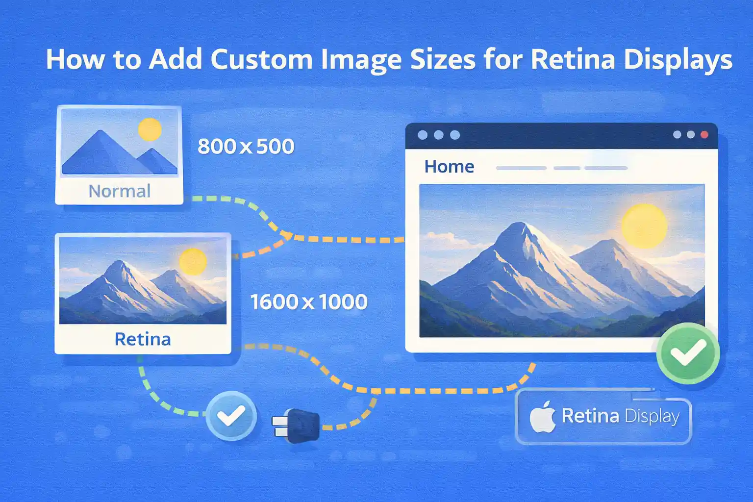
Step 1: Define Retina-Aware Image Sizes
The recommended pattern is to define both the display size and its 2x counterpart.
For example, if an image is displayed at 400×225 in CSS,
you should also generate an 800×450 version.
<?php
add_action( 'after_setup_theme', function () {

  // Base size (1x)
  add_image_size( 'card', 400, 225, true );

  // Retina size (2x)
  add_image_size( 'card-2x', 800, 450, true );

} );
Naming convention tips:
- Use semantic names (
card,hero,thumbnail-wide) - Suffix Retina sizes with
-2x(or-retina)
Step 2: Enable Theme Support for Thumbnails
Custom image sizes won’t work unless your theme supports post thumbnails.
<?php
add_action( 'after_setup_theme', function () {
  add_theme_support( 'post-thumbnails' );
} );
Step 3: Use the Base Size in Templates (Important)
When outputting images, always reference the base (1x) size.
WordPress will automatically include the Retina size in srcset.
Correct Usage
<?php
the_post_thumbnail( 'card' );
This produces HTML similar to:
<img
  src="image-400x225.jpg"
  srcset="image-400x225.jpg 400w, image-800x450.jpg 800w"
  sizes="(max-width: 400px) 100vw, 400px"
>
The browser chooses the best image based on screen size and pixel density.
What NOT to Do
- Do not hardcode the 2x image as
src - Do not manually swap images with JavaScript
- Do not use
srcsetmanually unless you have a special case
Step 4: Add a Proper sizes Attribute
WordPress generates a default sizes value, but it’s often too generic.
For best results, customize it to match your layout.
Filter wp_calculate_image_sizes
<?php
add_filter( 'wp_calculate_image_sizes', function ( $sizes, $size, $image_src, $image_meta, $attachment_id ) {

  // Apply only to a specific size
  if ( (int) $size[0] === 400 ) {
    return '(max-width: 480px) 100vw, 400px';
  }

  return $sizes;
}, 10, 5 );
This ensures:
- Mobile devices don’t download oversized images
- Retina displays still get sharp images
Step 5: Handle Background Images (CSS Retina)
CSS background images do not benefit from srcset.
You must handle Retina manually.
Media Query Approach
.hero {
  background-image: url("hero-800.jpg");
  background-size: cover;
}

@media (-webkit-min-device-pixel-ratio: 2), (min-resolution: 192dpi) {
  .hero {
    background-image: url("hero-1600.jpg");
  }
}
Use this only for large visual elements (heroes, banners).
For content images, prefer <img>.
Step 6: Regenerate Thumbnails (Existing Images)
New image sizes apply only to newly uploaded images.
For existing uploads, thumbnails must be regenerated.
Best practice:
- Regenerate only once after defining sizes
- Remove unused sizes before regenerating to avoid storage bloat
Performance Considerations
- Do not create Retina sizes for every image blindly
- Create 2x sizes only for images actually used in the design
- Avoid 3x unless you have a clear need
- Use WebP/AVIF if supported to offset file size increase
Common Mistakes
- Creating Retina sizes but never using the base size in templates
- Forgetting to update
sizes→ browser downloads images too large - Adding too many custom sizes and inflating storage
- Using CSS background images where
<img>is more appropriate
Recommended Naming Pattern
card→ 400×225card-2x→ 800×450hero→ 1200×630hero-2x→ 2400×1260
Summary
- Define base and 2x image sizes with
add_image_size() - Always output the base size in templates
- Let WordPress handle
srcsetautomatically - Customize
sizesfor accurate browser selection - Use CSS Retina techniques only for background images
When implemented correctly, Retina image support improves visual quality
without sacrificing performance or maintainability.
🎨 Want to learn more? Visit our WordPress Customization Hub for tips and advanced techniques.