Fix 100vh Issues on Mobile Safari (WordPress-Friendly Solutions)
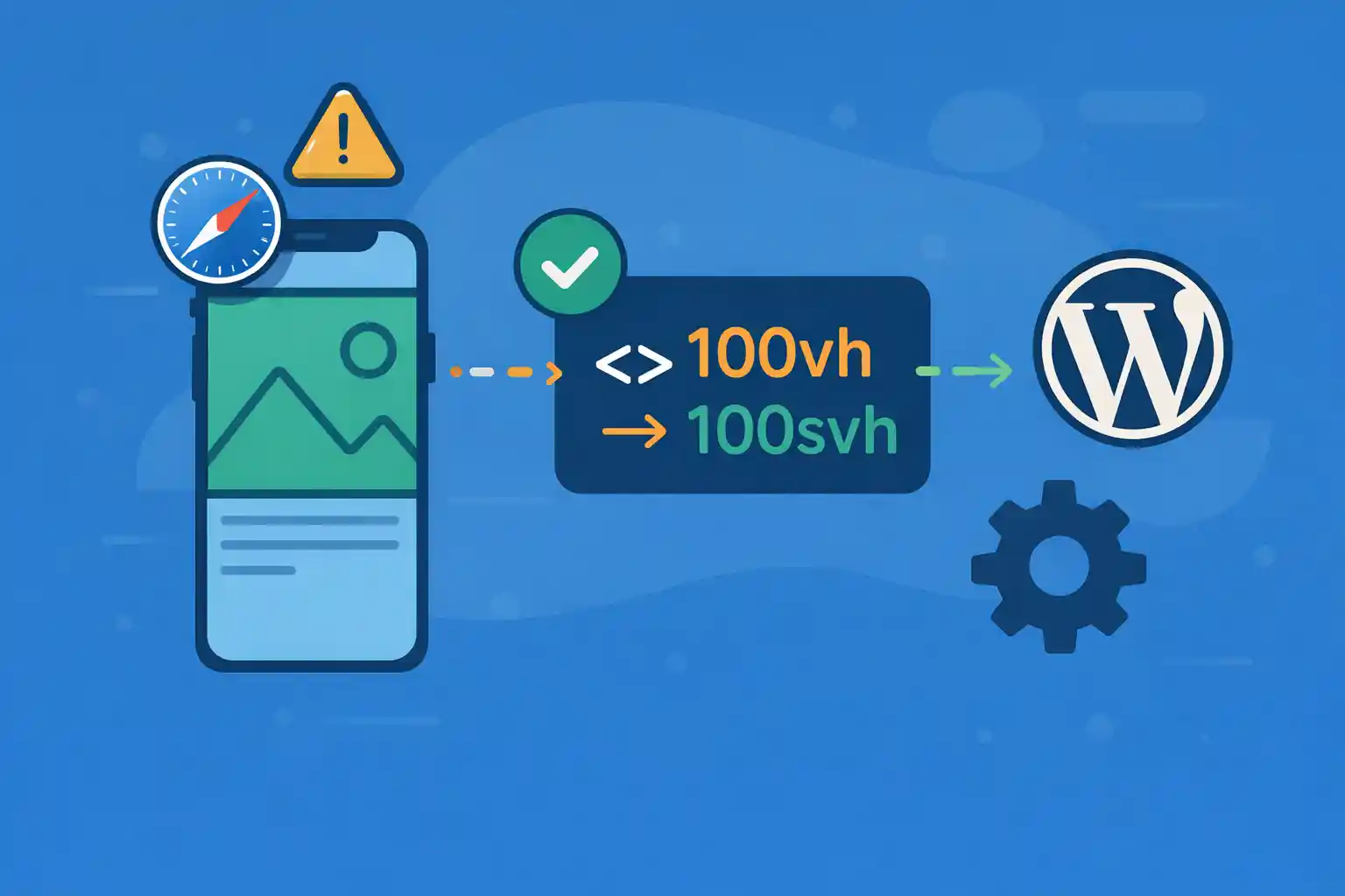
On iOS Safari, 100vh often behaves differently than expected because the browser UI (address bar / toolbar)
expands and collapses while scrolling. The result is a hero section that’s too tall, too short, or “jumps” when the UI changes.
This is a common source of layout shift (CLS) and broken full-height sections in WordPress themes—especially for hero headers,
mobile menus, and fullscreen modals.
Why 100vh Breaks on iOS Safari
Historically, mobile Safari calculated vh based on a “visual viewport” that didn’t consistently reflect the
currently visible area when the address bar is shown/hidden. So:
height: 100vhcan include space behind the browser UI- Sections can overflow and force unwanted scrolling
- Heights can change mid-scroll, causing visible jumps
Recommended Strategy
Use a layered approach:
- Prefer modern viewport units (
svh,dvh,lvh) when available - Provide a safe fallback for older iOS via CSS + optional tiny JS
- Keep it WordPress-friendly: enqueue a small script only when needed
Solution 1: Use Modern Viewport Units (Best When Supported)
Modern CSS viewport units:
100svh: “small viewport height” (when UI is visible) → stable, avoids overflow100dvh: “dynamic viewport height” (updates with UI changes) → matches visible area but can resize while scrolling100lvh: “large viewport height” (when UI is hidden) → can be too tall at first
For most hero sections, svh is the safest default because it avoids content being pushed behind Safari UI.
For true fullscreen overlays, dvh is usually the best match.
Hero Section: Stable Height (Avoid Jumping)
/* Stable hero: avoids iOS Safari overflow issues */
.hero {
  min-height: 100vh;
  min-height: 100svh;
}
Fullscreen Overlay / Mobile Menu: Match Visible Area
/* Overlay wants the visible viewport, even as UI changes */
.overlay {
  height: 100vh;
  height: 100dvh;
}
Using both lines is intentional: older browsers use 100vh, modern ones override with svh/dvh.
Solution 2: iOS Fallback with CSS Variable (Most Reliable Cross-Version)
If you need consistent behavior on older iOS Safari versions, set a CSS custom property based on the real viewport height.
This is the most reliable “no-surprises” fix for full-height sections.
CSS: Use a Custom Property as the Height Source
:root {
  --vh: 1vh;
}

/* Use calc(var(--vh) * 100) instead of 100vh */
.hero {
  min-height: calc(var(--vh) * 100);
}
JavaScript: Set –vh to window.innerHeight * 0.01
This script is small and safe. It updates on resize and orientation changes.
(function () {
  function setVh() {
    var vh = window.innerHeight * 0.01;
    document.documentElement.style.setProperty('--vh', vh + 'px');
  }

  setVh();

  window.addEventListener('resize', setVh, { passive: true });
  window.addEventListener('orientationchange', setVh, { passive: true });
})();
Why this works: window.innerHeight reflects the visible viewport height more accurately on mobile Safari.
Solution 3: Use -webkit-fill-available (Useful as a Fallback)
Some iOS Safari versions support -webkit-fill-available. It’s not a complete replacement for the modern viewport units,
but it can help in specific layouts.
/* Often used for iOS Safari fallback */
.hero {
  min-height: 100vh;
  min-height: -webkit-fill-available;
}
This is best treated as an additional fallback, not your primary solution.
WordPress-Friendly Implementation
If your theme only needs the JS-based fix on specific templates (hero landing page, fullscreen menu, modal),
enqueue it conditionally.
functions.php: Enqueue Script Only Where Needed
<?php
add_action( 'wp_enqueue_scripts', function () {
  if ( is_admin() ) {
    return;
  }

  // Example: only on the front page or a landing page template
  if ( is_front_page() || is_page_template( 'templates/landing.php' ) ) {
    wp_enqueue_script(
      'vh-fix',
      get_template_directory_uri() . '/assets/js/vh-fix.js',
      array(),
      '1.0.0',
      true
    );
  }
}, 20 );
Then place the JS snippet into assets/js/vh-fix.js.
Which Solution Should You Choose?
- If you target modern browsers: use
100svh(hero) and100dvh(overlays) - If you need broad iOS coverage: use the CSS variable (
--vh) approach - If you want extra safety: add
-webkit-fill-availableas a fallback
Common Pitfalls
- Using only
height: 100vhfor mobile menus (causes overflow behind Safari UI) - Using
100dvhfor hero sections and then complaining about “jumping” during scroll - Applying the JS fix globally (unnecessary overhead). Scope it to pages that need it
- Forgetting
min-heightvsheight(heroes often work better withmin-height)
Practical Patterns (Copy/Paste)
Stable Hero (Recommended Default)
.hero {
  min-height: 100vh;
  min-height: 100svh;
}
Fullscreen Overlay (Modal / Mobile Nav)
.overlay {
  height: 100vh;
  height: 100dvh;
}
Maximum Compatibility (Hero + JS Variable)
:root { --vh: 1vh; }

.hero {
  min-height: 100vh;
  min-height: 100svh;
  min-height: calc(var(--vh) * 100);
}
Summary
- Mobile Safari makes
100vhunreliable due to dynamic browser UI - Use
100svhfor stable heroes and100dvhfor true fullscreen overlays - For older iOS, the most reliable fix is a CSS variable set via
window.innerHeight - In WordPress, enqueue the JS only on templates/pages that need it
With these patterns, you can eliminate “jumping” full-height sections on iOS Safari and keep your WordPress theme
both stable and performance-friendly.
🎨 Want to learn more? Visit our WordPress Customization Hub for tips and advanced techniques.