Fix 100vh Issues on Mobile Safari (WordPress-Friendly Solutions)
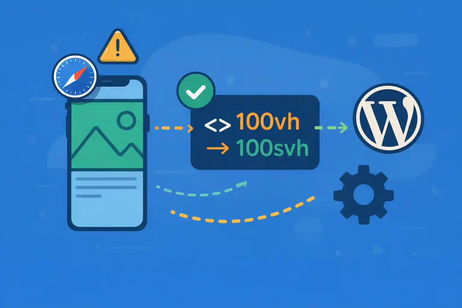
On iOS Safari, 100vh often produces the wrong height because the browser UI (address bar / toolbar)
expands and collapses while scrolling. This can make full-height heroes too tall, cause unwanted scrolling,
or create visible “jumping” when the viewport changes.
This article provides WordPress-friendly fixes that work in real themes:
modern CSS viewport units when available, and a reliable fallback for older iOS versions.
Why 100vh Breaks on iOS Safari
Mobile Safari’s viewport height is not stable. The visible area changes when the address bar shows/hides,
but vh historically did not always track that area correctly.
As a result:
- Elements sized with
height: 100vhmay extend behind the browser UI - Layout can shift when the UI collapses/expands (CLS-like “jump”)
- Fullscreen overlays can overflow and become scrollable
Choose the Right Tool: svh vs dvh vs JS Fallback
Modern CSS provides new viewport units:
svh: “small viewport height” (stable, safest for heroes)dvh: “dynamic viewport height” (tracks the visible viewport; best for overlays)lvh: “large viewport height” (can be too tall initially)
Practical recommendation:
- Hero / above-the-fold sections: prefer
min-height: 100svh(stable) - Fullscreen menus / modals: prefer
height: 100dvh(matches visible viewport) - Older iOS support: use the CSS variable (
--vh) fallback
Solution 1: Use Modern Viewport Units (No JavaScript)
Stable Hero (Recommended Default)
.hero {
  min-height: 100vh;
  min-height: 100svh;
}
100svh avoids overflow behind Safari UI and prevents unexpected scrolling.
Fullscreen Overlay (Mobile Menu / Modal)
.overlay {
  height: 100vh;
  height: 100dvh;
}
100dvh tracks the visible viewport, so overlays fit the actual screen area.
Solution 2: Most Reliable Fallback (CSS Variable + Tiny JS)
For older iOS versions where svh/dvh are not reliable or not supported,
use a CSS custom property set by JavaScript.
CSS
:root {
  --vh: 1vh;
}

.fullscreen {
  height: calc(var(--vh) * 100);
}
JavaScript
(function () {
  function setVh() {
    var vh = window.innerHeight * 0.01;
    document.documentElement.style.setProperty('--vh', vh + 'px');
  }

  setVh();
  window.addEventListener('resize', setVh, { passive: true });
  window.addEventListener('orientationchange', setVh, { passive: true });
})();
This uses window.innerHeight, which reflects the visible viewport more accurately on iOS Safari.
Solution 3: Add -webkit-fill-available as an Extra Fallback
In some Safari versions, -webkit-fill-available can help. Treat it as optional backup.
.hero {
  min-height: 100vh;
  min-height: 100svh;
  min-height: -webkit-fill-available;
}
WordPress-Friendly Implementation (Conditional Enqueue)
If you use the JS fallback, enqueue it only where needed (front page hero, landing templates, fullscreen menu pages).
functions.php
<?php
add_action( 'wp_enqueue_scripts', function () {
  if ( is_admin() ) {
    return;
  }

  // Example: only on front page or landing template
  if ( is_front_page() || is_page_template( 'templates/landing.php' ) ) {
    wp_enqueue_script(
      'wpct-vh-fix',
      get_template_directory_uri() . '/assets/js/vh-fix.js',
      array(),
      '1.0.0',
      true
    );
  }
}, 20 );
Place the JS snippet into assets/js/vh-fix.js.
Practical Patterns (Copy/Paste)
Hero Section (Stable)
.hero {
  min-height: 100vh;
  min-height: 100svh;
}
Mobile Menu / Modal (Fullscreen)
.mobile-nav {
  height: 100vh;
  height: 100dvh;
}
Maximum Compatibility (Hero + JS Variable)
:root { --vh: 1vh; }

.hero {
  min-height: 100vh;
  min-height: 100svh;
  min-height: calc(var(--vh) * 100);
}
Common Pitfalls
- Using
height: 100vhfor heroes (forces exact height and can cut off content) - Using
100dvhfor heroes and then seeing “jumping” during scroll - Applying the JS fix site-wide (unnecessary overhead)
- Forgetting to test rotation (portrait/landscape)
Summary
- iOS Safari makes
100vhunreliable due to dynamic browser UI - Use
100svhfor stable hero sections - Use
100dvhfor true fullscreen overlays - For older iOS, the most reliable fix is the
--vhCSS variable approach - In WordPress, enqueue the JS fallback only on pages that need it
With these patterns, you can eliminate the most common full-height bugs on mobile Safari
while keeping your WordPress theme maintainable and performance-friendly.
🎨 Want to learn more? Visit our WordPress Customization Hub for tips and advanced techniques.